


Suppose you are giving a presentation in front of the class or colleagues, and you can already feel something is off. You spent hours building the slides, double-checking the numbers, and making sure that everything is lined up properly. But the moment it shows up on the screen, people look confused because they don’t get it. You start thinking that it might be because your data is wrong, but that’s not always the case. It’s because you picked the wrong chart for the job that wasn’t actually built to answer the questions you were asked.
Charts are not just there to make your presentation look pretty. They're translators. The purpose of the chart is to explain data to people in a way they understand within seconds. Therefore, it is essential to pick the right chart so that your message lands before you’ve even finished your sentence.
So, let's get into the actual types of charts and graphs for data visualization, what each one is built to do, and when reaching for it makes sense.
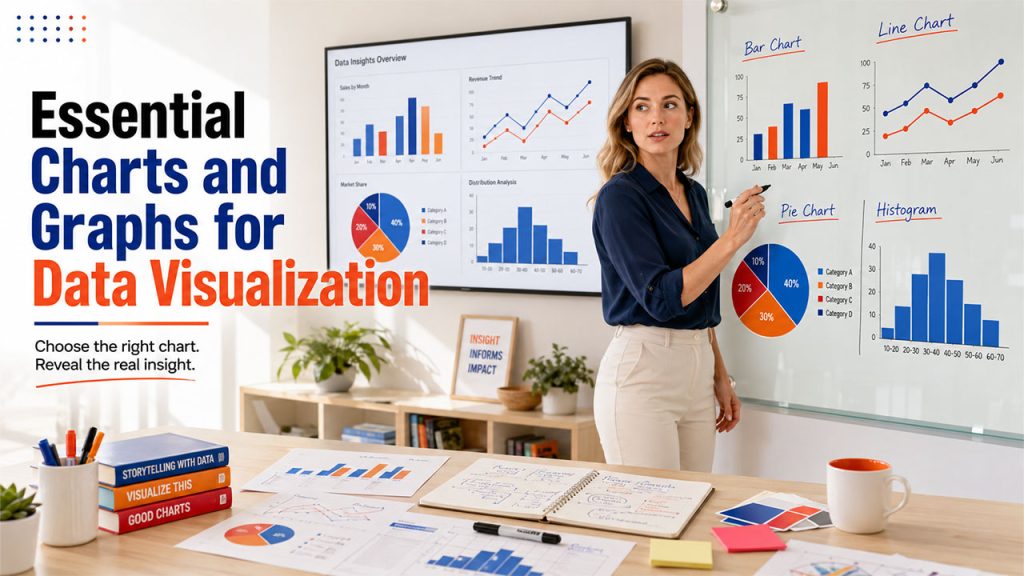
Essential Charts and Graphs for Data Visualization
These four are the ones that you'll use constantly, almost without thinking. They're reliable, and honestly, most data stories start with one of these before they need anything fancier. These four charts handle most everyday reporting, and they're just as common in IoT data visualization dashboards.
1. Bar Chart
A bar chart has rectangular bars where the length of each bar matches its value, and you can run them horizontally or vertically. It is one of the simplest charts.
When to Use it:
- Comparing values across different categories
- Showing how data is distributed across groups
- Situations where you want instant, no-explanation-needed clarity
2. Line Chart
A line chart connects data points with straight lines. Its whole purpose is to show movements such as how something rises, falls, or holds steady. This chart works well if your data has a "before and after" story to tell.
When to Use it:
- Tracking trends or patterns over a period of time
- Comparing how multiple groups move in relation to each other
- Visualizing things like project timelines or growth curves
3. Pie Chart
The pie chart is a circle that is sliced into pieces. Each slice represents a share of the whole. However, the catch is that it only works well when there aren't too many categories competing for attention.
When to Use it:
- Showing proportions or percentages within one total
- Datasets with a small number of categories, ideally under six or seven
- Quick visual snapshots rather than detailed analysis
4. Histogram
People usually confuse this with bar charts, but they’re not the same thing. A bar chart places a single value per category. Whereas a histogram plots a range. It shows you how a continuous dataset is spread out, bucket by bucket.
When to Use it:
- Understanding the spread or variation within a dataset
- Spotting outliers or unusual clusters of values
- Working with large enough datasets that bins actually mean something
The difference becomes much clearer once you see a side-by-side histogram vs bar graph comparison.
Best Charts for Comparing Data and Performance

After you have covered the basics, you start encountering questions like “how does this stack up against that?” These charts are specifically built to show side-by-side comparisons, whether it is across categories, time periods, or layered components.
5. Column Chart
This chart closely resembles the bar chart. You can just flip it vertically, and it turns into a bar chart. It compares values across categories using upright bars, and it's especially good at highlighting rankings or making orders pop visually.
When to Use it:
- Comparing performance across categories
- Displaying rankings so patterns jump out quickly
- Keeping visuals clean without unnecessary clutter
6. Stacked Bar Chart
You can think of this as a bar chart that got a little more ambitious and fancier. Each bar still represents a total, but it's broken into segments that show how individual pieces add up to make that total.
When to Use it:
- Comparing totals across categories while also showing composition
- Visualizing things like sales by product line over several quarters
- Breaking down expenses or tickets by type and priority
7. Radar Chart
It is sometimes called a spider chart because of its shape. It plots multiple variables across a circular grid. It's not for everyday comparisons, but when you need to compare several dimensions at once, it works the best.
When to Use it:
- Comparing multiple variables across a handful of categories
- Spotting gaps or strengths, like satisfaction scores across service centers
- Keeping comparisons compact instead of spreading them across several charts
8. Waterfall Chart
This is the chart if you want to tell a "how did we get here" story. It starts with an initial value, then shows a sequence of positive and negative changes that lead to the final number, cascading down like a waterfall. That's why it is called the waterfall chart.
When to Use it:
- Explaining how a starting value was affected by several factors
- Visualizing financial changes like profit bridges or budget shifts
- Making the sequence of contributing factors easy to follow
Best Charts for Showing Trends and Changes Over Time
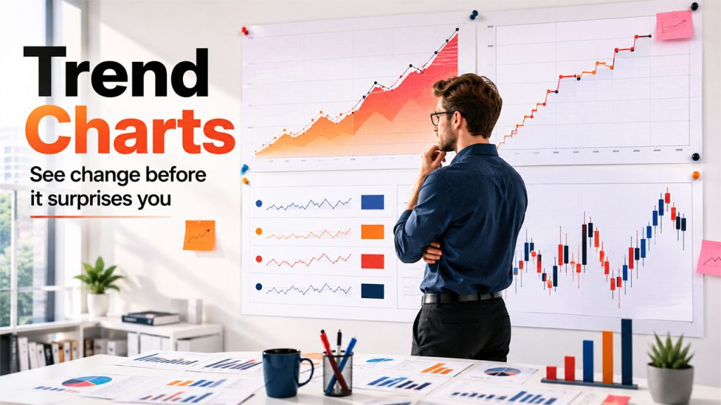
Some stories can’t be described in a single moment. They are a movement. These charts are specifically built to track change, whether that change is gradual, sudden, or volatile.
9. Area Chart
Take a line chart, then fill in the space underneath the line, and you've got an area chart. That shaded fill is more than just a nice look-at; it emphasizes the magnitude of change, which makes cumulative values easier to read at a glance.
When to Use it:
- Showing cumulative totals over time
- Visualizing things like monthly revenue or yearly marketing spend
- Comparing at least two datasets, since a single line doesn't need filling
10. Step chart
This is a line chart with attitude. It does not use smooth diagonal movement; rather, it uses horizontal and vertical lines to show abrupt and discrete changes. It's completely transparent about the fact that values jumped, rather than implying a gradual shift that didn't really happen.
When to Use it:
- Showing pricing changes, policy shifts, or system status updates
- Making it clear that values held steady between changes
- Avoiding the false impression of smooth, gradual movement
11. Sparkline
A sparkline strips a line chart down to its bare essentials. It does not have any axes or labels, just a tiny curved line that shows direction. It's meant to live inside a table or dashboard tile, quietly adding context.
When to Use it:
- Showing quick trends next to numeric KPIs
- Saving space in dashboards or summary tables
- Giving viewers a glance, not a deep dive
12. Candlestick Chart
This is widely used by finance folks so that they can showcase the price movement of a derivative, security, or currency over time. Each "candle" provides information about the opening price, closing price, and the high-low range for a given period, all in one compact shape.
When to Use it:
- Analyzing price movements for stocks, currencies, or other securities
- Spotting patterns traders use for technical analysis
- Visualizing volatility within short, specific time windows
Best Charts for Analyzing Relationships and Correlations
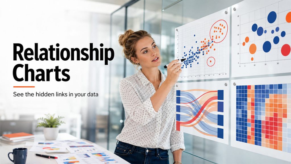
This is where things get a bit more analytical. These charts answer questions like: does X actually move with Y, or is that just a coincidence? They talk less about “what happened” and more about “why it happened.”
13. Scatter Plot
A scatter plot throws individual data points onto a grid based on two variables, and the pattern they form or don't form tells the story. When the clusters are tight, they suggest correlation, whereas scattered chaos suggests a lack of correlation.
When to Use it:
- Exploring relationships between two continuous variables
- Identifying trends, clusters, or correlations
- Spotting outliers that don't fit the broader pattern
14. Bubble Chart
Take a scatter plot and add a third variable, represented by the size of each dot, and you've got a bubble chart. It comes in handy when two dimensions just aren't enough to tell the whole story.
When to Use it:
- Comparing three variables at once
- Working with large datasets where size differences carry meaning
- Spotting trends and outliers across more complex relationships
15. Sankey Chart
At first glance, this might seem unusual. It’s wide, colorful flows connect one set of items to another. Those connections are called links, and the things being connected are nodes. It's built for showing movement and proportion simultaneously.
When to Use it:
- Illustrating many-to-many relationships, like product categories and sales channels
- Mapping pathways through multiple sequential stages
- Showing where volume concentrates and where it thins out
16. Heatmap
A heatmap uses color intensity across a grid to represent values, so darker or brighter cells immediately draw the eye to where the action is. It's less about exact numbers and more about pattern recognition at a glance.
When to Use it:
- Establishing relationships between two variables across a grid
- Spotting patterns or concentrations quickly
- Comparing performance across many categories without scanning a table
Best Geographic Charts for Location-Based Data

When your story involves location, you need a specific chart to bring a map into the picture.
17. Geo Chart
This maps values directly onto geographic regions, like countries, states, or cities. It uses color shading to represent magnitude. It's the most direct way to answer, "Where is this happening?"
When to Use it:
- Comparing performance across regions, like sales by country
- Visualizing metrics like website traffic by state
- Spotting regional patterns at a glance
18. Scatter Map
Instead of using shaded regions, a scatter map drops individual points onto specific coordinates. It works well when you care about exact locations rather than broad regional totals.
When to Use it:
- Showing location-specific events, like store locations or deliveries
- Spotting spatial clusters or outliers
- Visualizing incidents or check-ins tied to precise points
19. Geographic Bubble Chart
This chart works like a bubble chart, but instead of plotting points on a regular grid, it places them on an actual map. So, you can see exactly where something is happening, and the size of each bubble tells you how big or small that value is in that location.
When to Use it:
- Comparing values across specific locations, like store performance
- Showing both position and magnitude simultaneously
- Identifying regional outliers that a flat map might hide
20. Choropleth-Style Heat Map
It can be considered a close relative of the geo chart. This version uses color intensity across geographic boundaries to show density or concentration, rather than discrete data points.
When to Use it:
- Visualizing population density or regional intensity
- Comparing concentration levels across neighboring areas
- Making broad geographic patterns easy to spot instantly
Best Charts for Showing Data Composition
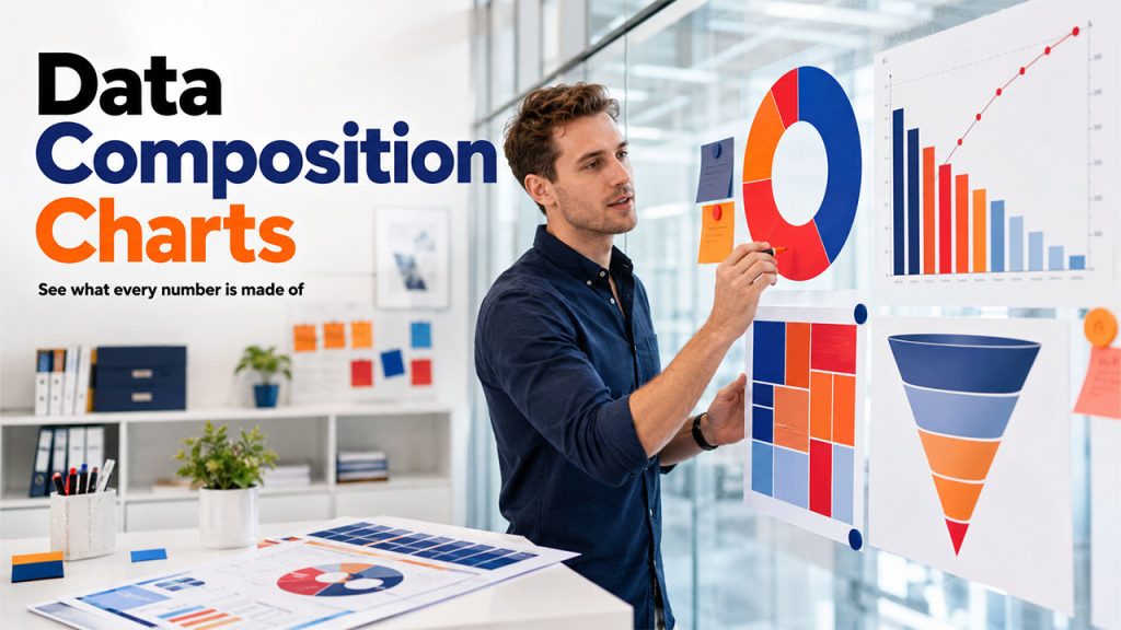
These charts answer, "What's this made of?" They break a whole into its parts, which sounds simple but gets surprisingly nuanced depending on how many parts you're dealing with.
21. Donut Chart
It is basically a pie chart with the center cut out. It might sound like a minor tweak, but it actually makes a real difference. That hollow center makes it easier to handle more categories without things turning into a visual mess.
When to Use it:
- Showing how categories contribute to a whole
- Handling a larger number of categories than a pie chart comfortably allows
- Comparing multiple data series within the same shape
22. Treemap Chart
This visualizes data as nested rectangles. The rectangles are sized according to the value they represent. It's a strong fit when your data has a hierarchy baked into it, like categories and subcategories.
When to Use it:
- Visualizing hierarchical or categorical data
- Showing part-to-whole relationships
- Spotting which categories dominate the overall composition
23. Pareto Chart
This pairs bars with a line graph, where the bars show individual values in descending order, and the line tracks the cumulative percentage. It's basically a visual nod to the 80/20 rule.
When to Use it:
Identifying the key factors driving an outcome
Highlighting which problems carry the most impact
Prioritizing where attention should go first
24. Funnel Chart
It is shaped exactly like it sounds, wide at the top and narrowing toward the bottom. This chart is usually used in businesses to track pipeline flow. With this chart, you can see how many users make it to the next stage. It tracks progression or drop-off through stages.
When to Use it:
- Showing attrition through a process, like a sales pipeline
- Comparing volume across sequential stages
- Highlighting where the biggest drop-offs happen
How to Choose the Right Types of Charts and Graphs for Data Visualization
Here's how you can pick the right chart for data visualization:
Define Your Data Visualization Goal: First, assess what you are trying to do with charts. Do you want to compare things, show a trend, explore a relationship, map locations, or break down a whole into parts? This way, you can find the answer quicker than you think as it narrows down your options.
Match the Chart Type to Your Data Structure: Before you pick a shape for it, understand your data and its type. A small dataset and a massive one don't always need the same chart.
Consider Your Audience and Their Data Literacy: You must also consider who's actually going to look at the chart. A room full of analysts can handle more complexity than a room full of execs glancing at slides for ten seconds.
Prioritize Simplicity and Readability: When you're stuck between two options, go with whichever one needs less explaining. If you have to talk to someone through it, it's probably not the right pick.
Focus on Insights, Not Visual Effects: Don't throw in extra colors, labels, or effects just because you can. Add them only when they actually help someone understand the data faster.
Conclusion
Data visualization isn't about making things look pretty, even though good design certainly helps. It's about translating raw numbers into something a person can understand without a tutorial. The right chart does that instantly. The wrong one just adds another layer between your insight and the decision it's supposed to drive. Tools like Julius AI are already making this easier by letting you generate charts from plain language instead of manually picking and building them.
As tools get smarter and more interactive, picking the right types of charts and graphs for data visualization is becoming less about guesswork and more about understanding what question you're actually trying to answer. When you get that part right, the right chart shows itself.