


Cross-platform icon design becomes significantly more complex when a product ships as native iOS, Android, and Windows applications. What starts as a simple icon selection process quickly evolves into a design system challenge involving platform conventions, visual consistency, and asset management.
What Changes When “One Icon Set” Becomes Three Native Platforms
Effective cross-platform icon design requires balancing consistency with platform-specific expectations. Designers must ensure icons feel native on each operating system while maintaining a recognizable product identity across devices.
Maintaining visual consistency across multiple platforms is a core part of modern UX design principles, especially when users interact with the same product across mobile, desktop, and web environments.
Ship the same product as native iOS, Android, and Windows apps and icons stop being a cosmetic layer. They start behaving like a hard design system constraint.
You’re no longer just picking “a nice pack”. You’re managing:
- Platform-specific metaphors and shapes
- Different stroke weights and corner radii
- Color vs monochrome expectations
- Multiple asset pipelines and formats
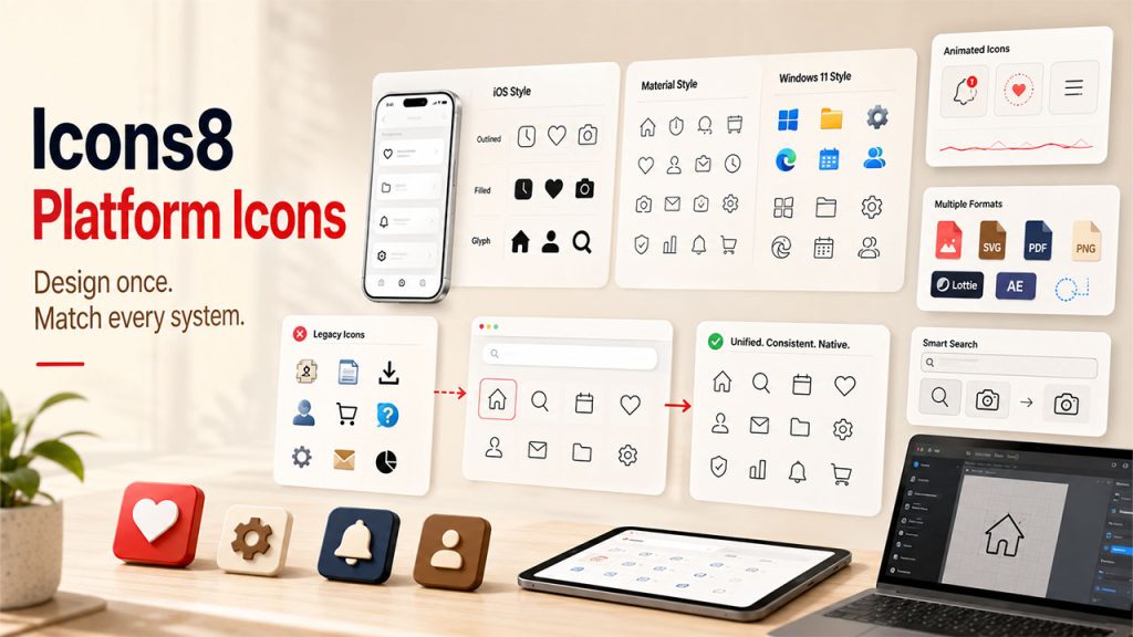
Use iOS 17 outlined icons in your iOS app and your Android build has to feel at home in Material. Windows users expect Windows 11’s visual language. That nudges you toward either three separate icon sets or one library that can cover all three without drifting.
Icons8’s icon library has become one of the more pragmatic options for this situation: 1,476,100+ icons, 45+ visual styles, and explicit platform categories for Apple, Android, Windows, web, and general graphic design work.
The tradeoffs are real, and you feel them most as a design system lead.
A Typical Cross‑Platform Day With Icons8
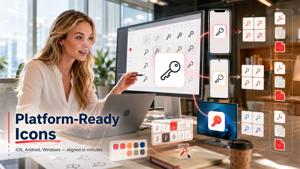
Wednesday afternoon, our design system lead, Priya, sits in a meeting room prepping icons for a new “Secrets management” feature going into:
- iOS native app
- Android app
- A Windows desktop tool for IT
Her workflow inside Icons8 looks like this:
1. Search once, branch by platform
In the browser she searches “key”, filters by static icons and in‑house designers, then flips through styles.
She pins:
- An iOS 17 Outlined key for the iOS app
- A Material Outlined key for Android
- A Windows 11 Color variant for the Windows client
2. Create platform collections
Those go into three collections: iOS / Security, Android / Security, and Windows / Security. Collections behave as small, shareable icon sets with drag and drop and bulk export.
3. Align brand color across platforms
Using recolor in search and in the editor, she tests the brand primary on each style. For monochrome sets, she runs bulk recolor on the whole collection so every security icon shares the same HEX value.
4. Prepare deliverables per team
Mobile engineers get SVG exports from collections
- The Windows team prefers PNGs, so she exports those at their preferred pixel sizes
- For docs, she keeps a separate collection exported as PDFs for crisp printing
In under an hour she has platform-appropriate, brand-aligned icons ready for three engineering teams and documentation, without opening a vector editor.
That single search would have turned into three separate tasks with smaller, platform-specific packs or a thin in-house set.
How Icons8 Supports Native Platform Nuance
One of the biggest hurdles in cross-platform icon design is maintaining platform authenticity without creating entirely separate workflows for each operating system.
Platform-aligned styles
Styles track system guidelines explicitly: iOS 17 (Outlined, Filled, Glyph) with 30,000+ icons, Material Outlined with thousands more, and Windows 11 in both Color and Outline with about 17,000 icons. Shipping large features while staying visually native starts to feel realistic.
Depth in each style
Many styles pass 10,000 icons. That matters once your product surface area grows and you start covering edge cases. You don’t want to “fall off a cliff” and start mixing stray icons from random packs.
Animated icons where motion is part of the system
There are 4,500+ animated icons in formats your teams can actually plug in: GIF, Lottie JSON, and After Effects projects. Paired with static PNG, SVG, and PDF options, the same concept can stretch from micro interactions to marketing decks.
Search tuned for system-level work
Text search respects synonyms. Image search lets you drop in an old asset and find a visually similar replacement, which helps when modernizing legacy tools. Filters by style, animated vs static, and designer keep one-off inconsistencies from creeping in.
In the middle of restructuring our platform icon set, the team used the icon search plus styles menu to walk topic by topic, picking equivalents in iOS, Material, and Windows 11 styles, then parking them into parallel collections.
Two End‑To‑End Scenarios From Real Projects
1. Feature rollout across four surfaces
When we launched an approvals feature across iOS, Android, Windows, and web. This becomes especially important for products that prioritize mobile-first design, where icons often serve as primary navigation and action cues on smaller screens:
- We listed the core concepts: request, approve, reject, history.
- In Icons8, we found a base group in iOS 17 Outlined and saved them to a
Core / Approvalscollection. - Using the Styles menu, we jumped each icon into equivalent Material Outlined and Windows 11 Outline versions, building sibling collections per platform.
- Bulk recolor kept monochrome sets on the same neutral gray, while web got a slightly richer color set.
- From each collection, engineers pulled SVGs; the marketing team exported high-res PNGs for landing pages and PDFs for sales decks.
Those icon mappings now live as three mirrored collections that new team members can explore without touching design files.
2. Documentation and training refresh
For a training portal overhaul:
- We tapped the Popular and Characters free categories, which unlock PNG, SVG, and PDF without a paid plan, to illustrate how-to articles and internal slides.
- In the editor, we added text labels and square backgrounds to call out “warning” vs “tip” blocks.
- A shared collection link let our documentation writers clone the set, tweak colors, and export at the resolutions they needed.
For internal-only content, staying inside those free categories with attribution stayed manageable while we kept paid usage focused on product UI.
How It Stacks Up Against Other Approaches
Against in-house icon design, Icons8 trades perfect custom fit for speed and scale. Hand-drawn enterprise sets tend to stall once you need thousands of icons across multiple platforms plus animated variants. You either dilute consistency with ad hoc additions or slow delivery.
Open source packs like Feather or Heroicons shine for a single web app. For three native platforms, you usually end up stitching multiple packs together and manually ironing out style differences.
Versus other large services such as Flaticon or Noun Project, the advantage Icons8 gave us for system work was the mix of:
- Explicit platform-focused styles
- Collections with bulk recolor and export
- An in-browser editor so designers don’t have to round-trip every tweak through a vector tool
You still get a hosted library, not a full design ops platform, but it slots neatly into existing tooling via Figma, Photoshop, Illustrator plugins, and the Pichon Mac app for drag and drop.
Where Icons8 Starts To Strain
Some situations call for a different primary approach:
Heavily bespoke brand iconography
When a brand hangs on a very idiosyncratic icon language, custom work still leads. Icons8 can fill gaps and cover long tails, but it won’t define that language for you.
Strict legal or approval workflows
Logos and Characters categories require separate approval from trademark owners for commercial use. In large regulated enterprises, that extra review step can make these categories less attractive.
Free tier for serious multi-platform shipping
The free plan works well for experiments, but PNGs cap at 100px and attribution is required. SVG mostly sits behind paid plans. That clashes with the needs of a polished design system spread across dozens of tools.
Targeting a single platform with a small, stable product and a lightweight in-house set or focused open-source pack can feel like a better fit.
Practical Tips For Design System Leads Using Icons8
A few habits made the library workable at enterprise scale:
- Mirror your design system taxonomy in Collections:
Platform / Domain / State. - Decide up front which Icons8 styles count as “approved” per platform and document them in your design guidelines.
- Use image search to replace legacy icons: drop the old asset, pick a close match in your chosen style, then standardize.
- Stick to simplified SVG by default and only uncheck it when you actually need editable paths for deeper tweaks.
- Treat animated icons like components: create dedicated collections by interaction type and export in Lottie JSON or GIF based on your platform capabilities.
Used this way, Icons8 stops feeling like a random grab-bag and starts acting as a structured, cross-platform asset layer that supports a serious design system instead of fighting it.
Conclusion
Cross-platform icon design requires balancing native platform expectations with design system consistency. For teams supporting iOS, Android, Windows, and web experiences simultaneously, a scalable icon library can reduce maintenance overhead while helping products feel at home on every platform. The right workflow isn't just about finding icons—it's about creating a sustainable system that supports long-term product growth.